Don’t Look Down: 10 Peculiarly Precarious Modern Buildings
The world’s worst skyscraper disaster is still fresh in our minds, and every year sees a new calamity in our global obsession with building storey after storey, higher and higher. You would think that all architects would be careful to make their buildings look as stable as mountains. You’d be wrong. Thanks to modern building materials and behind-the-scenes architectural wizardry, the new field of precarious-looking urban architecture is on the rise – as these ten vertigo-inducing examples illustrate.
(Image via: arch daily)
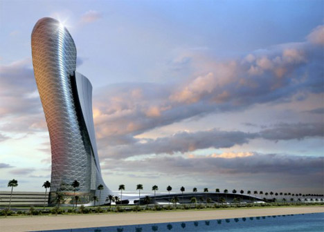
Capital Gate, Abu Dhabi – the most acutely leaning building in the world. It bows out 18 degrees from the vertical – in comparison, Pisa’s famous tower is only leaning at 3.99 degrees. Technologically ambitious and architecturally stunning, it looks like nothing on earth. (Well, okay, it does look like something in particular, but this is a family-friendly corner of the Web and we refuse to draw certain parallels).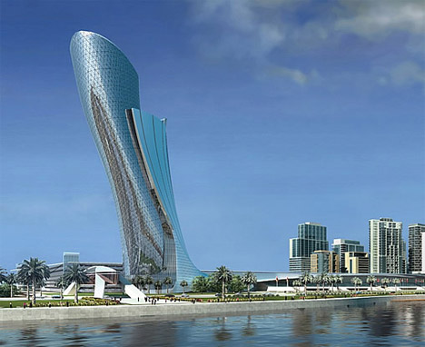
(Image via: cosmoworlds)
And by the looks of the first concept drawings, Capital Gate was meant to be even more ambitious. How on earth would this design have stayed up? Judging from the reworked shape, the designers couldn’t answer that question either.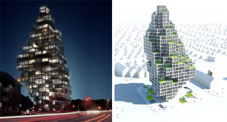
(Images via: luxuo)
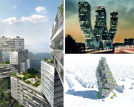
If you live in the Danish principality of Rødovre, you may see this queasy-making structure against the skyline. This ‘Sky Village’ is made up of 60 metre square blocks built up around the building’s core. Exactly how is up to the buildiers – meaning that in theory, no two buildings would look alike. We applaud engineering flexibility, but our applause for rock-steady stability is louder. Exactly how will it stay upright, please?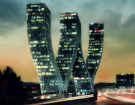
(Image via: freshome)
It may look like a bad or possibly drunken attempt at Photoshopping – but the Walters Towers will soon be reality. Forming an enormous W (possibly standing for “weird”), this apartment block complex in Prague is the slightly fevered work of architects Bjarke Ingels Group, and for obvious reasons, uses the latest in load-bearing building materials.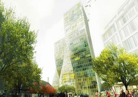
(Image via: freshome)
Our questions are endless. Do the lifts go diagonally? Is it safe? How would it fit in with the current Prague skyline? Is it safe? Exactly how is the weight distributed? Oh, and is it safe?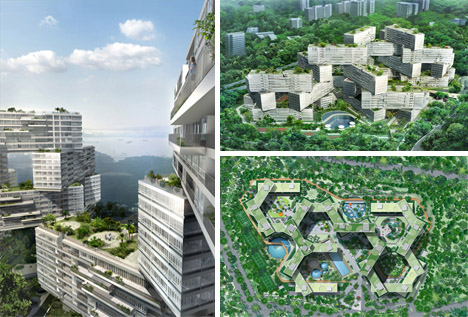
(Images via: design boom)
How would you feel about living in a building that looks less built than balanced? This Singaporean residential complex by OMA comprises of 31 six-storey apartment buildings stacked up in a thrilling haphazard manner, with the aim of circulating fresh air around every building. Since this is Singapore, heat loss wouldn’t be a problem – but what about air-con efficiency? And that certainly isn’t a balcony-view for the squeamish.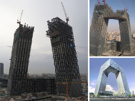
(Images via: gayol87 and IASeNews)
Costing over $600 million and reaching 51 floors into the blue, the China Central Television Headquarters in Beijing was completed in December 2008. It is built of steel, and its two rakishly-skewed towers had to be joined in the dead of night when the metal was coolest, to prevent expansion distortion. The local nickname? “Big shorts”.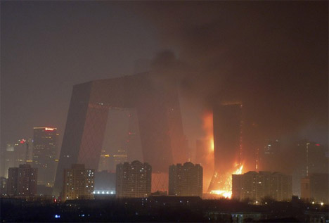
(Image via: daylife / Reuters)
In February this year, it narrowly escaped damage when the nearby Television Cultural Centre caught fire after opening ceremony fireworks went awry. This event has sparked an inquiry into the widespread use of high-explosive fireworks in China – and into the subsequent attempt by national authorities to suppress coverage of the blaze.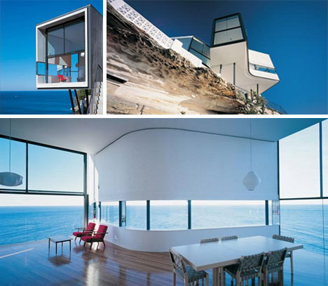
(Images via: coolboom)
Commanding what must be one of the most spectacular views in Sydney, the Holman House teeters on the brink of architectural possibilities. Although not quite as unstable as the above photos suggests, the house juts out from the cliff edge so alarmingly that we commend its current occupants for their nerve (and try to hide our jealousy at having that view). But isn’t the Sydney basin prone to earthquakes?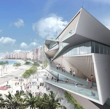
(Image via: dezeen)
The new Museum of Image and Sound in Rio de Janeiro is an award-winning response to the question “How unconventional can we make a museum look?” Looking like a stylishly collapsing carpark (ahem, arguably), the front-facing “vertical boulevard” hides galleries, auditoriums and even an outdoor cinema perched on top. No word on what the residents of the surrounding tower-blocks think of this last feature.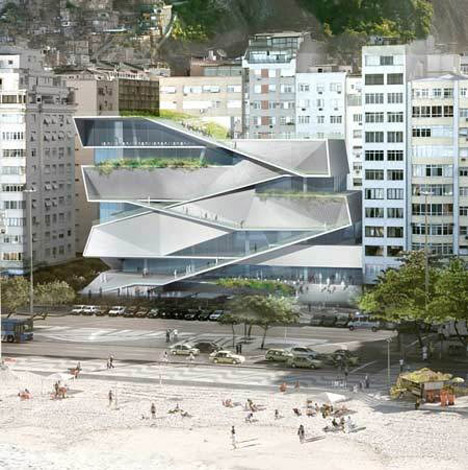
(Image via: dezeen)
Due to open in 2011, the design is meant to channel the energy of the beach promenade, providing an extension of its movement rather than an interruption. If they could turn one side of those steps into a waterslide, we think it would be made completely perfect.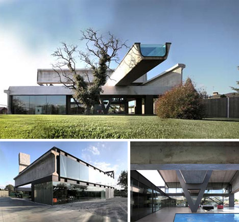
(Images via: homedesignfind)
As well as challenging our assumptions and sensibilities, good architecture should make us feel happy. So what about this house from Ensamble Studio that seems designed to perturb, upset and make us permanently uneasy? From the swimming pool sticking out into thin air to the apparently badly-supported slab of concrete poking high above the roof, this void-riddled structure is certainly fascinating and challenging…but is it lovable?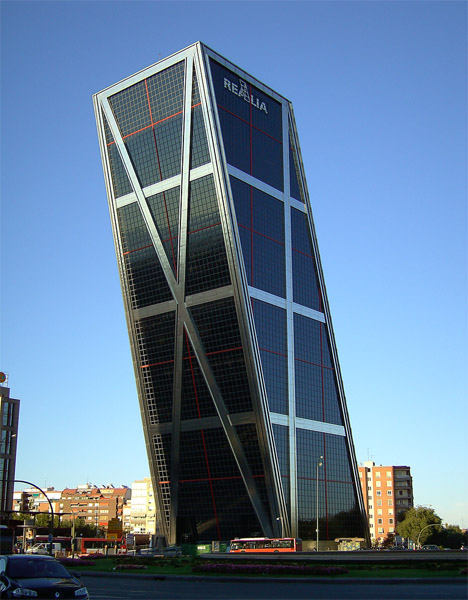
(Image via: skyscrapercity)
Unlike with Capital Gate, there is no attempt to subvert the shape of the two towers that make Madrid’s Puerta de Europa. These massive structures (115 metres tall) look like conventional skyscrapers – except ones that lean towards each other at a 15-degree angle.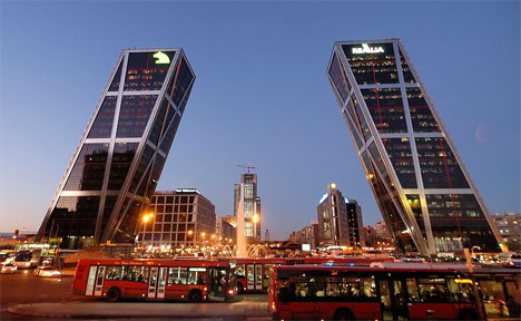
(Image via: luciapensache)
Completed in 1996, they were the world’s first leaning high-rise buildings (so urbanites who suffer from vertigo, you now have someone to blame for the trend). They are positioned so far apart to provide the room for a subway interchange.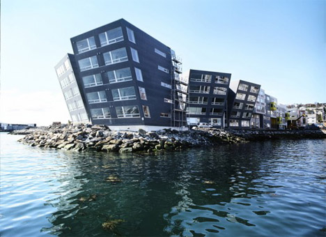
(Image via: arch daily)
The new housing development of Strandkanten in Tromsø, Norway, is 900 decided modernistic homes making best use of reclaimed land – and of design possibilities. The waterfront properties lean out over the water as if they long to go for a dip.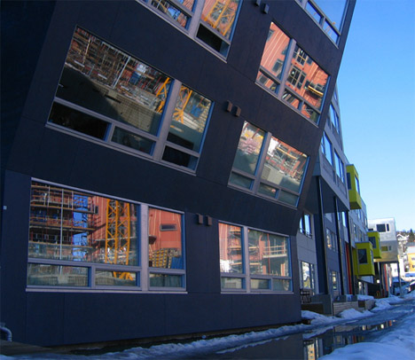
No comments:
Post a Comment